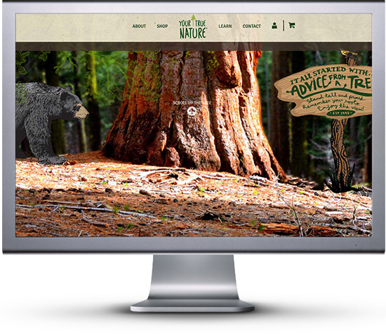
Your True Nature is a industry leader for postcards, magnets, mugs, and more relating to the enviornment, and they wanted a site that reflects that. They contracted out to a third party company, but felt they wanted more for their site and the user experience. They contacted us to work on animating the home page, working on their SEO, helping with customer retention, creating custom pages, and adding exciting new features to their shopify based store. We felt this would be a perfect job for us to work on and worked with them to create a user experience that helps others get a better feel of nature, learn about the origins of the company, help teachers interact with students, and sell nature related merchandise.

Animating The Story
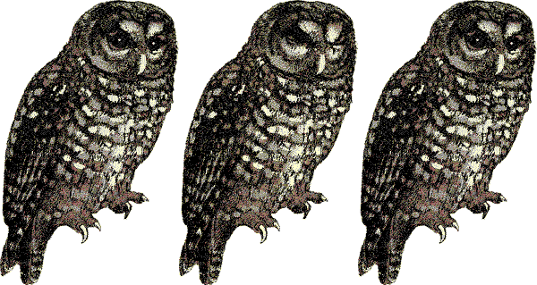
While the site’s homepage was looking good, they wanted great, and with that came a more living webpage. We placed animated gifs throughout the home page, and set them up in a way that would run on most any browser. The animated images made the site come alive as you continued to scroll. At first you only had a butter fly the would flap its wings 3 times total, then an owl that would blink slowly, followed by a hummingbird that would constantly flap it’s wings, and finally a squirrel moving its tail. The goal of this was to make the main homepage feel more like a living forest than just an image.




Store Navigation
The foundation of any great business is the storefront. It gives visitors the first impression of quality, and determines if they want to trust a business with their money. The goal of the web stores rework was to create fluid navigation for users. To start we created a custom script the changes the left side image every month, this takes users to pages about plants and animals that relate to that month. Next a simple search bar was added, allowing users after a specific product to easily find it, but also popular categories and product types were added below it too.
Making Members Feel Special
A custom membership area and blog sections were added to help new and current members interact more easily with the site. We changed the product pages and categories to allow users to select the amount of the of products they are after on every page, with related products located on the bottom of the page. The Shopify Storefront experience gave new and current users a professional yet comfortable experience when using the site.
It’s All About Retention
Customers now are visiting the site, and enjoy learning about the company, but we need to keep new and old customers coming back. This is where our customer retention plan goes into effect. To start members are enticed to create a free account to gain access to teaching tools, yoga guides, and other free perks by joining. Next a user is emailed, congratulating them on joining, and enticing them with free tree planting after their first purchase. After a user purchases from the site, a custom coded mailchimp app connects with their Shopify payment system auto opting members to the mailing list (which they can easily opt out of if desired). This mailing list periodically informs them of deals going on, new events, new products, and helps connect them to social media accounts improving the overall customer retention.



Final Thoughts

The project started out rough due to an older content management platform, but after a few months the project came together beautifully. My favorite part would be “meet the founders” section. The set up boxes for Ilan’s journey, and how you can click on them for an interactive popup, quickly became of my favorite pieces of work ever.
Nicholas Teagarden – CEO – Lead Developer
Nicholas Teagarden – CEO – Lead Developer
Contact Us Today
Sent us a email or give us a call today and find out how we can improve your site’s look, feel, and visibility.