.
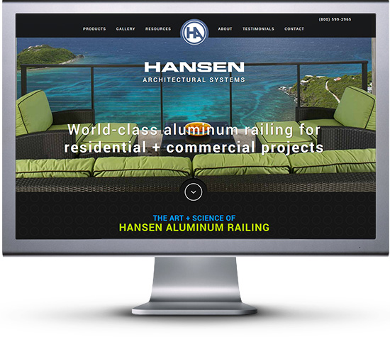
For years Hansen Aluminum Railing has been one of the worlds foremost retailers when it comes to aluminum railing. They cover boht residential and commercial railing, and have been featured in multiple magazine publications for their amazing public and private works. Hansen already had one website redesign years ago, but felt it was time to upgrade their site to a Web 2.0 experience. This included a more interactive homepage, product pages, and SEO features. While they already the best possible domain name for finding aluminum railing related goods and services, they still needed a proper way to keep the site updated with new and exciting things in the Aluminum Railing community. Their goal was to not only be number 1 in referrals, but number 1 in online presentation and search results.
The Meeting
We sat down with the CEO and Vice President of Hansen Aluminum Railing to get a better understanding of what they wanted and how we were going to provide that. Before our meeting we researched the competition to see were the stacked up website wise, and created 3 mock up templates based on the color palettes they wanted to use. In the meeting they selected one of our designs as the layout they loved, but wanted some minor tweaks to what they felt was best in representing the Hansen Aluminum Railing brand.
Setting The Scene
Hansen Aluminum Railing wanted to keep their theme of using 2 primary colors on a dark background, blue and yellow. So to start we created 2 custom backgrounds for them. One was the end of a aluminum pipe repeating, the other was their logo. This allowed us to create an overall style with the piping and then finish the users browing by ending with the logo being shown over and over. This gives subconscious reminder of the company in the back of the users mind helping to retain them for sales. We then implemented the colors throughout the homepage, but also used them to define sections of the company. Where blue will be related to all things commercial, and yellow will be all things residential. This color scheme throughout the site helps users feel comfortable with every section they are at.
Creating The Product Pages
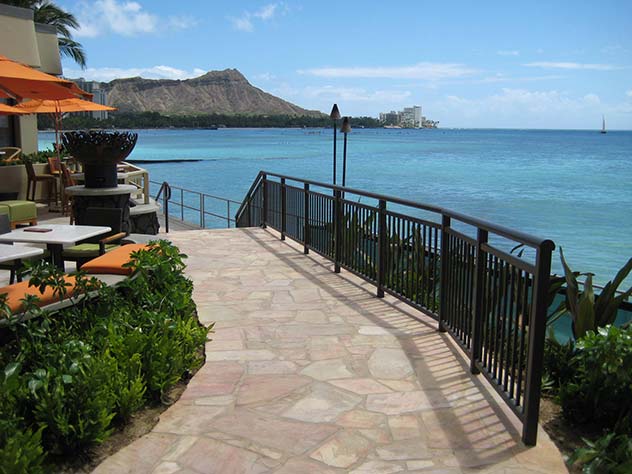
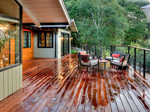
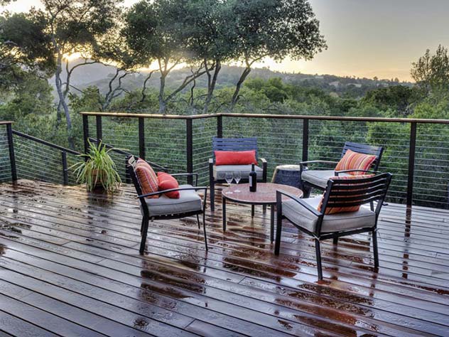
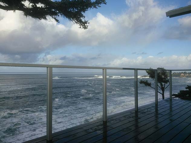
Hansen Aluminum Railing wanted each individual project page to stand out just as much as the home page. So we first began working with the Vice President and Graphics Department to obtain at least 3 large scale professional images of every product they have installed, plus multiple smaller images of each product. The larger images were placed at the top in a rotating banner, and the smaller images below in a gallery that can be clicked on for more information on that specific installation project.
Icons For Flare
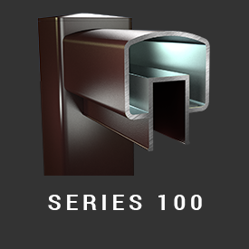
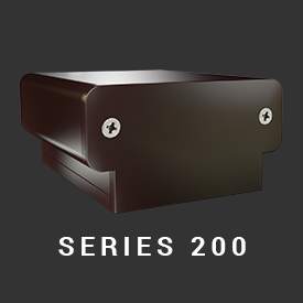
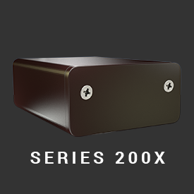
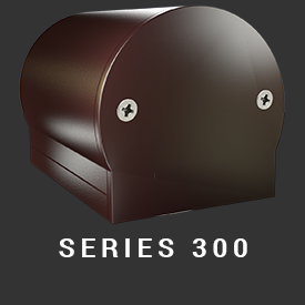
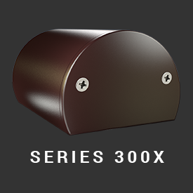
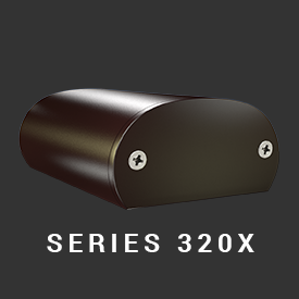
Next we worked with Hansen’s graphic department to create icons for different railing options for projects, as well we created some of our own icons for extra options. These gave visitors a more visual guide on picking the installation they are after.
Examples Are Key
When it comes to many businesses, having galleries of previous works goes a longs way towards getting new customers. This is especially true when it comes to the construction business. With Hansen Aluminum Railing we emphasized this throughout the entire site. On the home page we gave visitors examples of both residential and commercial works, but we also created a customer review section giving real quotes from previous customers accompanied by their project. We then went the extra mile and also applied examples of previous works on every product page. This helps to cast no doubt in the quality of products and craftsmanship from Hansen Aluminum Railing
Highlighting The Brochure
Hansen Aluminum Railing wanted to emphasize people clicking on their brochure. It is one of the most searched for things by professional artichets working for companies, and small contracts too. So they wanted this to be a focus point of the site. We decided to work their brochure and video together to help it stand out. The video’s play button naturally attracts a person to click it, and the 2 emphasized brochure buttons help direct users to click it next.
Final Thoughts

This project overall was pretty straight forward. We meet with Tracy Hansen and his team multiple times to get the layout down just how they wanted. They had hundreds of photos we customized to fit into the site and create a very industrialized website. When it comes to deciding what type of Aluminum Railing you want versus the competition, based on website alone people are going to pick Hansen Aluminum Railing over the others.
Nicholas Teagarden – CEO – Lead Developer
Nicholas Teagarden – CEO – Lead Developer
Contact Us Today
Sent us a email or give us a call today and find out how we can improve your site’s look, feel, and visibility.
